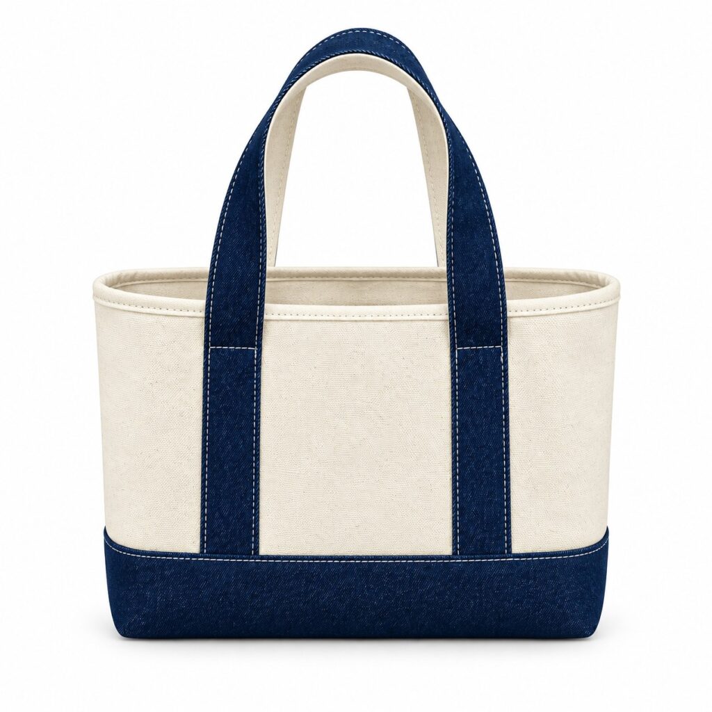
The printed logo looks close to the brand reference beside a window. At the shop counter, the comparison is less convincing. Before either team changes the ink or rejects the sample, they need to establish how the two objects were viewed.
Cotton tote print colour approval needs agreed lighting and an identified physical reference. Record those conditions while developing the sample so that the designer, buying team and proposed print provider are discussing the same comparison.
Choose the reference that represents the requirement
A brand colour reference should have a clear identity and a stated role in approval. Ask whether the buyer is referring to a supplied physical standard, an accepted printed sample or another specified reference.
A logo shown on a phone does not tell the other party which physical appearance has been accepted. Keep screen previews useful for communication, while identifying the material reference and review method that will settle the colour decision.
Mark the exact printed area to compare. A small logo element, a large filled panel and the surrounding bag colour may raise different questions. Avoid treating a general photograph as a complete colour decision for every part of the sample.
Which light should decide approval?
Agree the relevant viewing conditions with the responsible reviewer before sampling. If both a controlled evaluation and a particular retail environment matter, record those as separate requirements and state who can decide an unresolved result.
Lighting for printed tote samples should be described clearly enough for the reviewing teams to repeat the comparison. Record the source or location, how the samples are positioned and which reference is present.
X-Rite’s visual evaluation guidance explains the importance of lighting and metamerism. Colours that appear to match in one lighting condition may not match in another. That is a reason to agree conditions, not to promise that every material will look identical everywhere.
Do not turn a supplier’s demonstration into a universal viewing prescription. Ask a qualified colour reviewer which method is appropriate where a controlled brand requirement is important. Record the agreed method rather than borrowing a light setting from another product.
Keep the comparison repeatable
A viewing condition record should identify the tote sample, printed area, reference, location or light source, date and reviewer. Note which conditions were checked and keep unreviewed conditions visible as open items.
Place the printed sample and reference where they can be viewed together under the agreed conditions. Avoid comparing a fresh sample in one room with a remembered appearance from another. Photographs can record the arrangement, but camera and display differences can complicate remote colour judgements.
Where reviewers disagree, ask them to report the conditions and the specific observed difference. This provides a useful next question for the provider instead of a chain of comments that one photograph looks warmer than another.
Does a shop-light mismatch prove the wrong ink was used?
A changed comparison alone does not establish its cause. Record what differs under each condition and ask the provider or colour reviewer to investigate. Avoid diagnosing an ink, fabric or process fault from a remote photograph.
The fabric batch shade guide covers the separate material reference. Keep the print and cloth records connected without assuming that accepting one automatically accepts the other.
If another sample or revised print proposal is needed, give it a new identity. Compare it against the same agreed reference and conditions so the team can see what changed. A different lighting setup should not quietly replace an unresolved requirement.
Write the actual colour decision
A colour comparison decision should state the sample accepted, the reference used and the conditions covered. If a proposed limitation is accepted, describe it plainly and record who authorised that decision.
Keep numerical tolerances or instrument methods project-specific and agreed with the relevant provider or laboratory. A visually accepted logo does not establish rubbing performance, washing performance, material composition or an environmental certification.
The artwork approval guide can hold the accepted size and placement. Add the colour-reference identity so that the final design record includes more than the artwork filename.
Describe your colour requirement in the enquiry
Send Gahumi the artwork, proposed bag colour, physical reference details and the viewing conditions important to your project. Include quantities, destination, postcode and required date. Ask what evaluation, sample and quotation arrangements can be confirmed, without assuming a colour-matching service or result before review.
Email the reference details and viewing requirements to gzgahumibag@gmail.com.