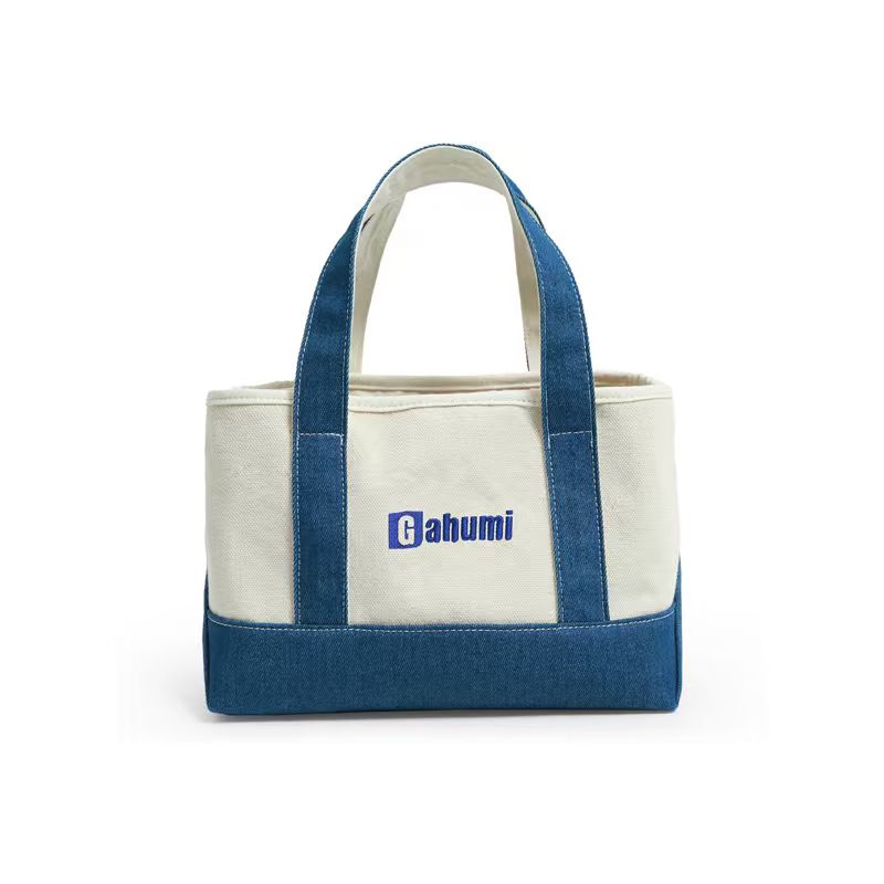
The artwork has not changed, but the sample has: a pale graphic approved on a light bag is now being considered on dark cotton. The next decision is not simply whether to use the same colour name. It is how the selected ink system will cover that background, and what the finished surface should look and feel like.
Dark cotton tote bag print opacity should be agreed on the actual proposed cloth. A digital mock-up can illustrate layout, but it cannot establish the coverage of a printed layer. Start by telling the printer whether the design is meant to be solid and bright or deliberately allows the dark fabric to influence its appearance.
An underbase is an option, not a universal rule
Not every dark cotton bag needs a white underbase. The answer depends on the ink system and design. An underbase is an initial printed layer used beneath other colours; an opaque ink may instead be proposed for direct printing. Ask which arrangement the supplier is actually quoting.
Ink manufacturer Permaset, for example, describes both direct opaque inks and an underbase product within its range. This demonstrates why the exact system matters. It does not mean Gahumi uses that brand, holds its approvals or can promise the manufacturer’s published performance on a particular bag.
If the desired effect is softer or intentionally subdued, show an authorised reference and state what you like about it. “Vintage” by itself does not define how much background should remain visible.
Describe the print you want
Identify the dark fabric reference, artwork version, final print size and colour target. Mark pale lettering, fine gaps and solid areas that are critical to the design. Include whether the image is on one side or both.
Ask the printer to name the proposed ink system and explain whether a base layer, additional colour separation or artwork adjustment is needed. Keep those details with the quote. Do not prescribe mesh counts, curing temperatures or repeated passes from a tutorial for a different material.
The artwork handoff guide covers file dimensions and placement. The printed sample then shows the coverage and feel that a file alone cannot establish.
Review a printed area large enough to answer the question
Approve pale printing on a dark tote using a sample of the proposed fabric and process, at the intended scale or with the important areas reproduced at full size. A tiny white square will not explain how a broad illustration feels when the panel bends.
Compare the coverage across the print, the visibility of fabric through solid areas and the edges of pale elements. Where an underbase is used, look for unintended pale outlines around the overprinted colours. Photograph the location and ask the printer to explain any proposed revision.
View the sample under consistent lighting alongside the accepted colour reference. Avoid repeatedly comparing photographs on different screens. If you need a tightly controlled brand colour, discuss the approval method and realistic limitations before accepting the quotation.
Touch and flex the printed cotton panel gently in ordinary handling. Try it open and folded, as it would be during repeated use. Select the coverage that achieves the intended design and feel; adding another layer of print is not an improvement in itself.
Separate appearance from performance evidence
A visually solid print does not, by itself, establish rubbing resistance, washing performance or chemical compliance. Ask which checks are relevant to the finished sample and agree the required evidence separately. Neither “water-based” nor “opaque” proves an environmental benefit for the whole product.
If a process change is proposed to improve coverage, ask what else needs review: fine detail, surface feel, care information and price may all be relevant. Keep the original and revised sample references distinct.
For a wider decision between decoration processes, use the screen printing and transfer comparison. Do not turn an opacity adjustment within one named process into approval of a different, unspecified process.
Compare what the print quotation includes
Ask what setup, base-layer work, sample development and revision charges are included. Give the same artwork dimensions and quantities to each proposal so the comparison remains meaningful. Do not assume a fixed surcharge for all dark bags or that every pale design needs the same treatment.
Send Gahumi the fabric shade, artwork, desired print effect and estimated quantities, together with the destination and postcode. Request a process-specific feasibility review and sample quote. Approve the actual fabric, ink proposal and appearance together, rather than writing only “white logo on black cotton”.
Request a dark-fabric print review Share artwork on WhatsApp
Prefer email? Send artwork and fabric references to gzgahumibag@gmail.com.