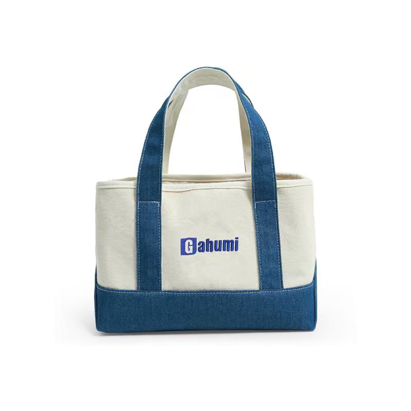
Keep the annotated colour boundaries and any accepted adjustment with the overall artwork size and placement brief. The complete handoff should identify the same graphic version and dimensions as the sample being reviewed.
The red and blue look right separately. Where they meet, a pale gap cuts through the illustration. Moving the whole logo higher would not correct it: the two printed colour layers need to relate to each other differently.
Cotton tote screen print registration is the alignment between those layers. Identify the important joins, explain whether a deliberate overlap is acceptable and agree how to review the finished print.
Draw attention to the joins that define the design
Mark colour boundaries on a preview of the approved artwork. Separate touching colours from colours intentionally divided by bare fabric. Identify outlines, small enclosed gaps and fine text where a change would alter recognition or legibility.
A colour count is not enough. Two separated colour blocks raise a different approval question from two colours meeting along a detailed face. Explain what the design must retain at its final printed size.
The screen-printing and transfer guide compares processes. Once a multi-screen proposal is being considered, this brief addresses the boundaries within that proposal rather than choosing a process again.
Approve any overlap between printed colours
Trapping introduces a controlled overlap between adjacent printed areas to avoid an unwanted exposed gap. Ryonet’s registration demonstration illustrates a trapping adjustment alongside screen alignment. It is a production-artwork decision, not permission to change the customer’s illustration unnoticed.
Ask the printer whether a boundary needs adjustment and request an enlarged view of the proposal beside the original. Have the designer or brand owner approve any changed outline or overlap. A black border should not be added to a design simply because another printer’s example used one.
Keep the original master and the approved production interpretation separate. Note what was changed and why. If the illustration is licensed, confirm that the relevant permission covers the proposed alteration before releasing it.
Review contact, overlap and intended gaps separately
For touching areas, inspect whether bare cloth appears where it should not. For overlapping areas, look for an unintended outline or a changed visible colour. For intended gaps, check whether they remain open enough to preserve the design.
Keep the approved cotton or cotton canvas in the trial when refining colour joins. A smoother substitute may give an unhelpful impression of a design intended for textured cloth. For a tote to be carried repeatedly, also look at the print on the opened bag and while the panel bends normally, not only while it is stretched flat.
Make those observations at the agreed finished size on the chosen fabric. An enlarged screen preview makes every detail easy to see, but it does not tell the buyer how a narrow gap will appear on a textured cotton panel.
Do not confuse this review with dark-cloth coverage. A pale underbase may introduce another layer that also needs alignment, but opacity and colour-to-colour registration are different acceptance points. The dark-fabric print guide covers the coverage question.
Agree acceptable alignment for this design
There is no single limit this guide can assign to every design and printing proposal. Discuss the critical details with the supplier before accepting a quotation. If a numerical tolerance is needed, agree its measurement points and feasibility for that particular job.
Physical examples can make the decision clearer. Keep the accepted sample and identify the places that were reviewed. A photograph of a close-up may help communicate a concern, but it should not be the only reference for a subtle colour boundary.
Avoid accepting one boundary while leaving the rest of the print unexamined. Choose representative locations across the graphic, especially fine elements and areas where several colours meet. Record what was checked rather than claiming every unit has perfect registration.
Confirm the sample and any changed costs
Ask whether the proposed adjustment changes separation work, screen requirements or sampling charges. A new outline can change the production artwork even when the customer-facing colour names remain the same.
Review the complete sample after the revision. The original gap may be gone while a fine opening has closed elsewhere. Keep any final acceptance tied to the actual cloth, artwork version, print size and named process.
For orders with several designs, identify which graphic has which approved production interpretation. One simple two-colour logo should not automatically approve a more detailed illustration in the same order.
Send Gahumi the master artwork, a preview marking critical joins, required dimensions, cotton bag reference, quantities and delivery destination. Ask Gahumi to assess feasibility, propose the sample work needed to resolve those joins and confirm any acceptable alignment before the order is released.
Email the annotated preview to gzgahumibag@gmail.com.